

Ben je tussen de 18 en 28 jaar oud? Dan kan je, als je aan onze voorwaarden voldoet, in aanmerking komen voor een appartement bij de Stichting Huisvesting Werkende Jongeren (SHWJ).


Wie zijn wij?
De SHWJ is ruim 50 jaar een begrip in Leiden en omgeving. De SHWJ verhuurt in Leiden ruim 800 wooneenheden aan (werkende) jongeren tussen 18 en 35 jaar.
Het woningaanbod is heel divers. De SHWJ heeft appartementen in kleinschalige monumentale panden in het centrum van Leiden, maar ook wat grotere complexen die in de jaren tachtig speciaal voor jongeren gebouwd zijn. Deze complexen liggen in het centrum, net buiten het centrum, in de Merenwijk en het Morskwartier.
Alle appartementen zijn voorzien van centrale verwarming. De woonruimtes zijn over het algemeen bescheiden qua oppervlak. De appartementen hebben een eigen eenvoudig uitgevoerde keuken en badkamer met wc. Alle appartementen komen voor huurtoeslag in aanmerking.
Jongerencontracten

De SHWJ maakt gebruik van jongerencontracten. Je huurt voor een periode van maximaal 5 jaar. Na 5 jaar kunnen we onder voorbehoud je contract voor maximaal 2 jaar verlengen. Inschrijven kan tot en met je 27e jaar.
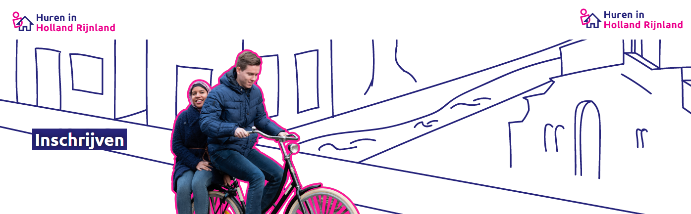
Huren in Holland Rijnland
Je moet ook ingeschreven staan bij hureninhollandrijnland.nl, zodat je goed kunt doorstromen voordat je te oud voor de SHWJ bent geworden.
Want wanneer je maximale huurtijd erop zit dan moet je echt weer vertrekken bij de SHWJ om plaats te maken voor nieuwe jonge starters op de krappe Leidse woningmarkt.
Kijk bij onze inschrijfvoorwaarden of je in aanmerking komt om je in te schrijven bij de S.H.W.J.


Transform CSS3
Typography, being the art of type in a design, is undoubtedly one of the most essential elements of good web design. It’s the visual art that helps us to create a beautiful and neat design that just works. However, the fact that it can be on the headline is that being one of the most important elements, it is still overlooked by many.
Good typography makes a design more appealing, leading a reader across the whole web page according to the importance of different text, but it is not just about the style, size and family of the font. It’s about realizing the high level of visual hierarchy that can be reached with the use of typography.
Since a screenshot worth thousand words, in this post we are willing to deliver you tips on improving typography in your web design and eventually 16 website screenshots with great typography applied, and the resources that will guide your typography skill to a higher level. It’s not just about what you say, but how you say it, right? Depending on your purpose, we could try to experiment more and get creative with our typography. We can be bold and daring with strong, large letters, or get quirky and unique with handwritten type. We should keep in mind that type should always be legible, because there’s no point in showing off type that no one can read. Type can do so much for a design if it sets rhythm and creates an atmosphere.
~100 CSS Class Available
Typography, being the art of type in a design, is undoubtedly one of the most essential elements of good web design. It’s the visual art that helps us to create a beautiful and neat design that just works. However, the fact that it can be on the headline is that being one of the most important elements, it is still overlooked by many.
Good typography makes a design more appealing, leading a reader across the whole web page according to the importance of different text, but it is not just about the style, size and family of the font. It’s about realizing the high level of visual hierarchy that can be reached with the use of typography.
Since a screenshot worth thousand words, in this post we are willing to deliver you tips on improving typography in your web design and eventually 16 website screenshots with great typography applied, and the resources that will guide your typography skill to a higher level. It’s not just about what you say, but how you say it, right? Depending on your purpose, we could try to experiment more and get creative with our typography. We can be bold and daring with strong, large letters, or get quirky and unique with handwritten type. We should keep in mind that type should always be legible, because there’s no point in showing off type that no one can read. Type can do so much for a design if it sets rhythm and creates an atmosphere.
Color
Typography, being the art of type in a design, is undoubtedly one of the most essential elements of good web design. It’s the visual art that helps us to create a beautiful and neat design that just works. However, the fact that it can be on the headline is that being one of the most important elements, it is still overlooked by many.
Good typography makes a design more appealing, leading a reader across the whole web page according to the importance of different text, but it is not just about the style, size and family of the font. It’s about realizing the high level of visual hierarchy that can be reached with the use of typography.
Since a screenshot worth thousand words, in this post we are willing to deliver you tips on improving typography in your web design and eventually 16 website screenshots with great typography applied, and the resources that will guide your typography skill to a higher level. It’s not just about what you say, but how you say it, right? Depending on your purpose, we could try to experiment more and get creative with our typography. We can be bold and daring with strong, large letters, or get quirky and unique with handwritten type. We should keep in mind that type should always be legible, because there’s no point in showing off type that no one can read. Type can do so much for a design if it sets rhythm and creates an atmosphere.